flex:flex-grow flex-shrink flex-basis
- flex-grow:定义放大比例,默认为 0,规定项目相对于其他灵活的项目进行扩展的量
- flex-shrink: 定义了项目的缩小比例,仅在宽度之和大于容器的时候才会发生收缩,其收缩的大小是依据 flex-shrink 的值,默认为 1
- flex-basis:给上面两个属性分配多余空间之前, 计算项目是否有多余空间, 默认值为 auto, 即项目本身的大小
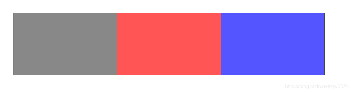
示例 1:
子元素都设置为 flex:1 的时候平均分
1
2
3
4
5
6
7
8
9
10
11
12
13
14
15
16
17
18
19
20
21
22
23
24
25
26
27
28
29
30
31
32
33
34
35
36
37
38
39
40
41
42
| <!DOCTYPE html>
<html lang="en">
<head>
<meta charset="UTF-8">
<meta http-equiv="X-UA-Compatible" content="IE=edge">
<meta name="viewport" content="width=device-width, initial-scale=1.0">
<title>Document</title>
<style>
html,
body {
padding: 0;
margin: 0;
}
.parent {
width: 1000px;
display: flex;
border: 1px solid #000;
margin: 50px;
}
.parent div {
height: 200px;
flex: 1;
}
.child-1 {
background-color: #888;
}
.child-2 {
background-color: #f55;
}
.child-3 {
background-color: #55f;
}
</style>
</head>
<body>
<div class="parent">
<div class="child-1"></div>
<div class="child-2"></div>
<div class="child-3"></div>
</div>
</body>
</html>
|
flex:1 === flex-grow: 1; flex-shrink: 1; flex-basis: 0%;
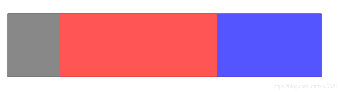
实现固定 1:3:2 比例排列:
将子元素的 flex 分别设置为 1,3,2,即可实现 1:3:2 的布局排列
1
2
3
4
5
6
7
8
9
10
11
12
13
14
| .child-1 {
flex: 1;
background-color: #888;
}
.child-2 {
flex: 3;
background-color: #f55;
}
.child-3 {
flex: 2;
background-color: #55f;
}
|
示例 2:
flex-basis:
1
2
3
4
5
| .child-1 {
flex-grow: 1;
flex-basis: 400px;
background-color: #888;
}
|
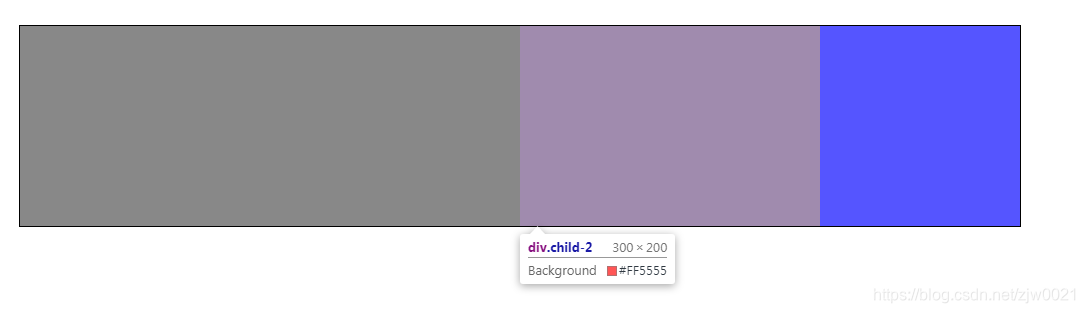
将第一个子元素 flex-basis 设置为 400px,则容器剩余分配部分为 1000px-400px=600px,
child-1: 400+600*(1/(1+3+2))=500px
child-2: 600*(3/(1+3+2))=300px
child-3: 600*(2/(1+3+2))=200px
示例 3:
flex-shrink:
1
2
3
4
5
6
7
8
9
10
11
12
13
14
15
16
17
18
19
20
| .parent div {
height: 200px;
flex-grow: 1;
flex-basis: 400px;
}
.child-1 {
flex-shrink: 1;
background-color: #888;
}
.child-2 {
flex-shrink: 2;
background-color: #f55;
}
.child-3 {
flex-shrink: 7;
background-color: #55f;
}
|
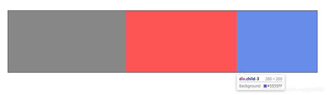
这里将三个子元素的 flex-grow 都设为 1,flex-basis 都设置为 400px,在不设置 flex-shrink 的情况下即使 3*400=1200px 大于容器的 1000px,但是依旧会平均分。
这里将子元素的 flex-shrink 分别设置为 1,2,7,则:超出部分为 400*3-1000=200px
child-1: 400px-200px*(1/(1+2+7))=380px
child-2: 400px-200px*(2/(1+2+7))=360px
child-3: 400px-200px*(7/(1+2+7))=260px

 微信
微信 支付宝
支付宝.jpg)
.jpg)


.jpg)